
When Is a Website Redesign Really Necessary?
New brand colors, a new program or even just the passage of time aren’t enough to justify a full-scale website overhaul. Use these signals to decide when a redesign is worth the effort.

By Rebecca Au-Mullaney
If you’re a marketer, you probably have a running list of things you’d improve on your website if you had the time and institutional buy-in. Often, the list is manageable on its own: a navigation update, a new page template, a design upgrade that works in new branding.
None of those, by itself, calls for a full redesign. So how do you know when the fixes have added up to something bigger? When you see either of these two signals, it’s usually a sign the problems have outgrown a quick patch.
A full website redesign involves:
- Conversations with key stakeholders to document all the pain points and missed opportunities in the current site
- Documenting every user pathway and third-party integration that the site should support
- Strategizing what new pages need to exist on the site (and using traffic analysis to find out what current website pages can be removed)
- Organizing each core website page into an intuitive navigational structure so your website visitors can find what they need
- Designing and developing page templates that allow users to move through your website’s content and complete desired actions
- Migrating existing content and writing content for any new pages
- Quality assurance and testing, 301 redirects to prevent dead links, tracking implementation and launch support
Signal 1: The Site Doesn’t Reflect Your Organization’s Identity and Mission
Does your homepage communicate — both in words and design — what your organization stands for and accomplishes? Does the layout of your highest-traffic pages feel dated? Could a first-time visitor quickly find out the impact your organization makes? If not, no amount of surface polish will fix the disconnect.
In 2025, the Cancer Marketing & Communications Association (formerly Public Affairs & Marketing Network) partnered with C/A to redesign its site. The project coincided with the rollout of the association’s new name and branding, but the work went far beyond just swapping out a logo and updating colors. In our discovery process, we learned that the old site didn’t adequately demonstrate the value of a CMCA membership. The primary callout on the homepage was to join, but it took several clicks to find details about member benefits.
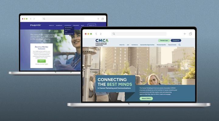
On the new site, we created a menu section that explores the benefits of membership. We threaded member testimonials throughout, and teased members-only content on public pages so prospective members could see what they were missing. Using a platform called Ultimate Member, we created a logged-in experience where members can discuss cancer marketing topics on a forum and contact each other privately.
A new page or menu update might have served as a temporary improvement, but upgrading the member functionality and weaving the organization’s value proposition through the whole site took a full redesign, not a patch.
Signal 2: Your Content and Audiences Have Outgrown the Structure
The clearest tell here is the workarounds you’ve accumulated — the patches you rely on because the site itself can’t do what you need. Sometimes that’s personal, like bookmarking a page because you can never navigate to it. Sometimes it’s structural, like spinning up separate microsites to reach audiences the main site was never built to serve. An occasional shortcut is normal, but when your core processes depend on these patches — especially when you’re building whole new sites to fill the gaps — the underlying structure has outgrown the original site.
Make Way for Books is an Arizona nonprofit that provides literacy support for young children, families and childcare providers. Originally, MWFB had a single website that explained the what and the why of its programs to potential donors. During the COVID-19 pandemic, MWFB began delivering its programs online and built two secondary sites to provide virtual resources to educators and families.
With three sites, educators had a learning management system and a parent enrolled in the family program could share a single link to tell a friend about it. But information was siloed, and users on the secondary sites never saw the larger scale of the organization’s mission.
We worked with MWFB to consolidate the three sites into one. We rebuilt the navigation to guide users to programs relevant to them and, using a WordPress-based learning management system and WooCommerce login functionality, created a custom experience for each user type.
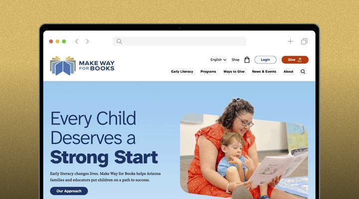
On the new site, families, educators and donors can each access their gated content within a single website that tells a persuasive story about MWFB’s early literacy approach.
It’s About How Much Has Changed
What both signals really measure is how much has changed since you launched your current site.
Maybe your mission or branding has changed, or you’ve begun serving audiences the site was never built for. Maybe the competitive landscape has changed and you need to differentiate yourself in a new way, or new technology has emerged that could make your site far more useful. Any one of these on its own rarely justifies a redesign.
But these changes tend to accumulate. When a lot has shifted in multiple areas, it’s time to stop patching and start thinking bigger.
Does Your Website Make the Right First Impression With Your Audience?
We can help you build a beautiful and functional website that grows with your organization.

Rebecca has more than a decade of experience in nonprofit, healthcare and higher education marketing, with roles ranging from alumni magazine editor-in-chief to director of strategic communications. At C/A, she oversees the creation and implementation of our website development and marketing automation plans, and serves as a bridge between developers and clients.
When she’s not working, Rebecca can be found exploring every park in a 30-minute radius with her young daughters. She enjoys journaling, painting and talking big ideas with her husband and friends.