
The Best Nonprofit Websites (And What You Can Learn From Them)
There’s an art to asking people to donate their time, money and attention. From museums to animal rescues, these nonprofit websites show how thoughtful design and strategy can support your mission at every click.

By Katie Bridges
At their core, the best nonprofit websites do one thing exceptionally well: They make passive visitors active participants. Whether that’s by donating, submitting an application or booking a visit, the path to meaningful action is clear, compelling and authentic.
But that’s easier said than done. Nonprofits are often working with limited resources, layered missions and audiences that span from first-time visitors to lifelong supporters. The sites below get it right and offer lessons worth borrowing.
The Heard Museum
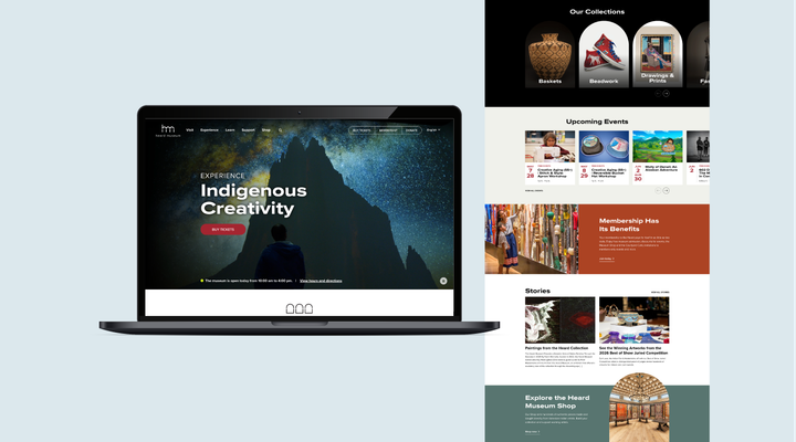
A museum’s website has one job: to inspire people to visit and give. Although the Heard Museum in Phoenix is recognized internationally for the quality of its collections and exhibitions, its website was largely static and didn’t capture the richness of the gallery spaces or the energy of its community events. We worked with the organization to redesign the site in a way that conveys that excitement while also making it easy for users to take their desired actions quickly and efficiently.
Stunning visuals and B-roll video offer users a glimpse of the Heard experience and show visitors what will be on view during their visit. Simple, action-oriented navigation provides clear paths to current and past exhibitions, educational content, a searchable calendar and more. The new site doesn’t just describe the experience — it showcases it. See the full case study.
Tucson Symphony Orchestra
To better reflect its mission and drive ticket sales, the Tucson Symphony Orchestra partnered with C/A to reimagine its website from the ground up. The new site balances elegant design with real functionality: intuitive navigation, bilingual content, seamless Ticketmaster integration and a flexible backend that supports evolving needs. Designed for first-timers and longtime subscribers alike, the site captures the spirit of the symphony while delivering a modern user experience that supports community connection, storytelling and conversion. See the full case study.
HonorHealth Research Institute
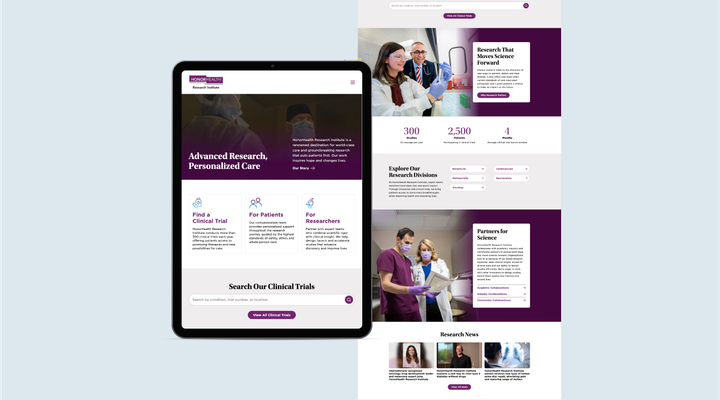
HonorHealth Research Institute provides patient care and conducts breakthrough medical research — and relies on philanthropy to help make it all happen. When we partnered with the organization on its redesigned website, we knew we needed to ensure the various audiences (patients, researchers, donors) had clear paths to content. The result is a site that is easy to navigate and has transformed something that once functioned like a roadblock into a strong resource for its audiences.
SSP International
SSP International is a nonprofit that provides STEM education to high school students and recent gradates. Its flagship program, the Summer Science Program (SSP), is one of the top science experiences in the country, but the previous website made it difficult to understand what the program entailed, or even how to apply. We worked with the organization to rebuild the site, introducing clearer information architecture, more prominent CTAs, comprehensive program pages and more.
Recognizing that SSP attracts international students, we also added language translation functionality so students and families worldwide can access the information needed to apply.
USC’s Bass Journalism & Justice Lab
The Charlotta Bass Journalism & Justice Lab at USC Annenberg needed a website as bold and layered as its mission: to preserve, study and share the legacy of Black media. C/A designed a site that’s immersive, intuitive and deeply mission-aligned — combining archival imagery, interactive timelines and integrated tools for events, podcasts and an AI-powered oral history archive. Built for students, researchers and the public alike, the site brings together the Lab’s work in one dynamic platform designed for access, engagement and growth. See the full case study.
Preservation Resource Center of New Orleans
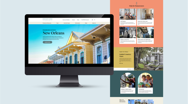
Preservation work is inherently local, and the PRCNO website leans into that identity with purpose. C/A redesigned the site to reflect the spirit of New Orleans by drawing inspiration from the city’s historic architecture, with thoughtful touches that capture users’ attention and compel them to dive deeper. And by centering the stories and neighborhoods that make New Orleans what it is, the site gives visitors an emotional stake in the work before asking them to support it. See the full case study.
Houston SPCA
The Houston SPCA website needs to serve two purposes: helping animals find homes and raising the funds needed to rescue them. But its website wasn’t performing, so the organization partnered with C/A on an overhaul. To help animals get adopted more quickly, the redesigned adoption directory allows visitors to filter by breed and browse detailed but easy-to-scan profiles that include contact info and photos of the animals.
On the donation side, mini donation forms create a low-friction first step for supporters who want to give but aren’t ready to commit to a full form. This is a good reminder that sometimes conversion requires a lower bar. Reducing the effort required to make a gift can be a powerful step in a one-time donor becoming a lifelong supporter. See the full case study.
Olmsted Network
Frederick Law Olmsted shaped the American landscape — quite literally. As the visionary behind Central Park, the U.S. Capitol Grounds and hundreds of other iconic places, he pioneered the idea that public parks are essential to democracy, health and community. Today, the Olmsted Network carries that mission forward, advocating for the preservation of his work and the progressive values he championed: access to nature, social equity and environmental sustainability. Its website brings that legacy to life through layered storytelling, intuitive design and a rich mix of resources. Built to welcome both longtime advocates and curious newcomers, it guides visitors through Olmsted’s ideas and the thousands of landscapes across the country that reflect them — inviting exploration, learning and action along the way.
Does Your Nonprofit Website Need a New Approach?
We can help design and develop a site that’s rooted in strategy.

Katie has almost a decade of editorial experience, spending most of those years as an editor at regional magazines. A Georgetown University grad, she helps guide digital and print content programs from concept to completion for C/A clients such as Vanderbilt Health, Niagara Falls USA and Phoenix Children’s Hospital Foundation. She has written for Garden & Gun, Washingtonian and Arkansas Life, among others.
The mother of two young girls, Katie can most often be found on a hiking trail with her family (Sedona’s a favorite). She’s a Southerner through and through, and the only member of the C/A team who uses the word “y’all” with abandon.